How I Taught Myself CSS (and Finally Centered a Div)
I didn’t pick up CSS because I dreamed of beautiful websites. I picked it up because my job needed it.
When I started in support and site administration, part of the work was keeping websites looking right: a menu that wrapped onto two lines, a button that sat a few pixels too low, a page that looked fine on my screen and broken on someone’s phone. Nobody was going to fix those for me, so I had to learn how.
Learning it every way at once
There was no single course. I learned CSS the way most of us really do, all at the same time:
- Trial and error. DevTools open, change a value, watch what moves, undo, try again.
- Copying and reverse-engineering. When a site did something I liked, I inspected it and rebuilt it until I understood why it worked.
- Tutorials and docs. For the “okay, but why” moments.
- Real projects. Nothing teaches you faster than a live site that has to look right by the end of the day.
That got me surprisingly far. It also got me stuck, because I was collecting fixes without understanding the system underneath.
The div that wouldn’t center
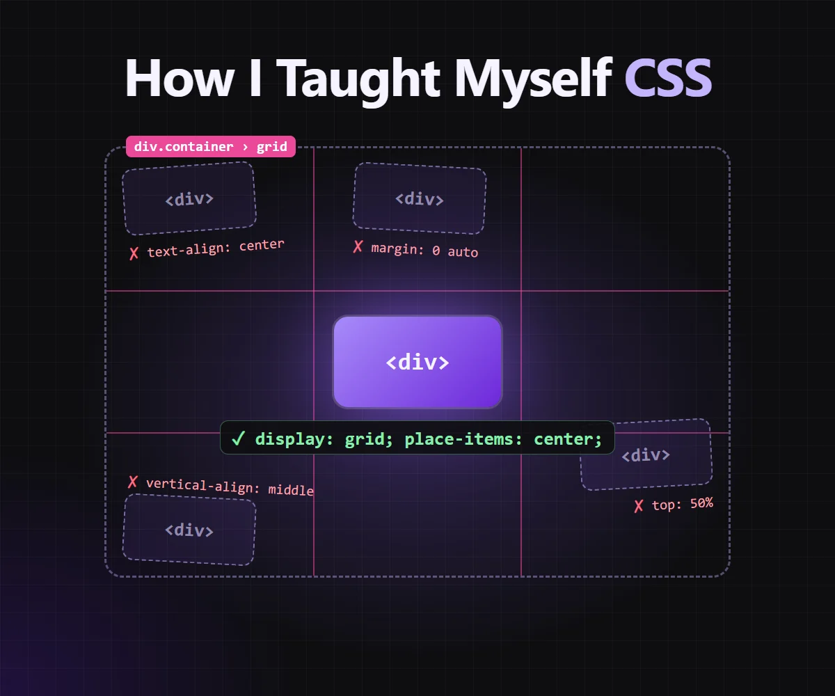
Every CSS story has this chapter. Mine was a box that had to sit in the middle of its container, both horizontally and vertically.
I tried everything I’d seen somewhere:
.box { text-align: center; }        /* only centers the text inside */
.box { margin: 0 auto; }            /* horizontal only, and only with a width */
.box { vertical-align: middle; }    /* does nothing on a block */
Each one half worked, or worked on one page and not the next. I didn’t need another trick. I needed to know why each attempt failed.
What actually made it click: the rules
The turning point was learning the basics properly, meaning how CSS actually decides things:
- The box model. Every element is a box of content, padding, border and margin. Once you picture the boxes, a lot of “mystery spacing” stops being a mystery.
- Display types. Block, inline and inline-block behave differently.
vertical-alignmeans nothing to a block element, andmargin: 0 autoneeds a block with a width. Suddenly my failed attempts made sense. - The cascade and specificity. When two rules disagree, CSS doesn’t pick randomly. It weighs origin, specificity and order. Understanding that ended most of my
!importanthabits. - Layout is the parent’s job. Centering isn’t something the box does to itself. It’s something the container does to its children.
That last one was the real “aha”. Once I stopped styling the child and started styling the parent, centering became one line:
.container {
  display: grid;
  place-items: center;
}
Or with Flexbox, when I need the extra control:
.container {
  display: flex;
  justify-content: center; /* main axis */
  align-items: center;     /* cross axis */
}
Then came the monolithic themes
Knowing the rules paid off when the real work arrived: refactoring big, monolithic CSS themes. You know the kind. A single stylesheet thousands of lines long, years of fixes stacked on top of each other, the same color written ten different ways, and selectors so specific that the only way to override them was another !important.
My first big one was at Classter. I was asked to refactor the theme of their portal, everything a user sees after logging in. That meant years of accumulated styles, with no room to break screens people used every day.
Some years later I came back to the same portal from the other side of the door. I reimagined its login page on my own, sketched the idea, and turned it into code. It became the new login page. The difference between the two projects was the whole journey: the first time I was untangling someone else’s CSS; the second time I knew exactly what I wanted the CSS to do.
Refactoring those taught me more than any tutorial:
- Find what’s actually used. Much of a legacy theme styles pages that no longer exist. Removing dead rules is the fastest win, and the file gets smaller and easier to read.
- Untangle specificity. Long selector chains and
!importantare usually symptoms of an earlier fight. Flattening them makes the next change boring, in a good way. - Name things once. Repeated colors, spacings and font sizes turn into variables, so a change happens in one place instead of fifty.
- Change one thing, then check. A refactor that looks identical before and after is a successful refactor.
The change that surprised me most was the simplest: writing short rules on one line. A big theme written one property per line reads like a JSON dump. You scroll forever, and you can’t see how rules relate to each other.
/* before: every rule is a tall block */
.btn {
  padding: 8px 16px;
  border-radius: 6px;
}
.btn-primary {
  background: #6d28d9;
  color: #fff;
}
.btn-ghost {
  background: transparent;
  color: #6d28d9;
}
/* after: one rule per line, and the whole family fits on screen */
.btn { padding: 8px 16px; border-radius: 6px; }
.btn-primary { background: #6d28d9; color: #fff; }
.btn-ghost { background: transparent; color: #6d28d9; }Suddenly I could see the whole family of related selectors at once, spot duplicates and inconsistencies at a glance, and fit ten times as much of the file on one screen. That was a game changer for me. Long or complex rules still get their own block, but the short, repetitive ones read like a table.
You don’t need fancy tools
Everything I needed to start was already in the browser. Firefox’s developer tools in particular are superb for learning CSS, with no extensions or paid tools required:
- Inspector + Rules panel: see every rule applied to an element, toggle them on and off, and spot crossed-out rules that lost the cascade.
- Box model view: margins, borders, padding and content drawn right on the page.
- Flexbox and Grid inspectors: overlay the lines, gaps and areas of a layout. Perfect for “why isn’t this centered?”
- Inactive CSS hints: Firefox tells you when a property does nothing in its context, like
vertical-alignon a block. That alone would have saved me a week. - Changes panel: tracks every edit you made in DevTools, so you can copy the working version back into your stylesheet.
- Responsive Design Mode: check the page at phone and tablet sizes without leaving your desk.
What I’d tell someone starting out
- Learn the rules before the tricks. Box model, display, the cascade and specificity. An afternoon on those saves you months of guessing.
- Open Firefox DevTools and stay there. Toggle properties, watch the box model, turn on the Grid and Flexbox overlays, and read the inactive-CSS hints. The browser will tell you exactly why something looks the way it does.
- Reverse-engineer what you like. Inspect it, rebuild it, then break it on purpose to see which line mattered.
- Think in parents and children. Most layout problems are solved one level up from where you’re looking.
- When you inherit a monolith, delete before you add. Dead rules and specificity fights are usually the real problem, not the missing new rule.
I learned CSS because I had to. I kept going because once the rules made sense, it stopped fighting me. And yes, I can center a div now, on the first try, most days.